How to design a good flyer?
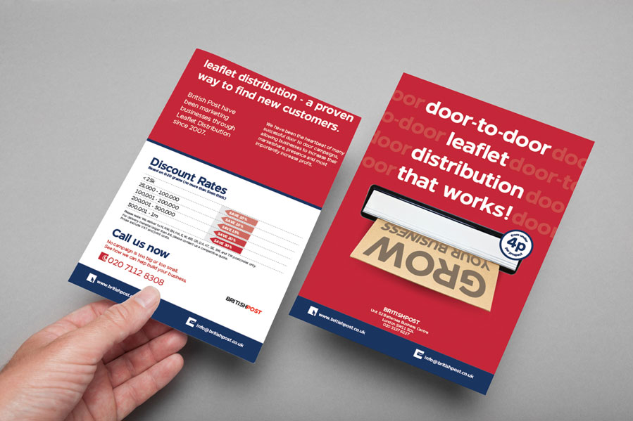
Designing a good flyer can be a great way to promote an event or business, or to share information with a specific audience. Here are some tips on How to design a good flyer:
- Keep it simple: A flyer should be easy to read and understand at a glance. Use a clean, clear layout and keep the text and images simple and uncluttered.
- Use a strong headline: The headline should grab the reader’s attention and clearly communicate the purpose of the flyer.
- Use eye-catching images: Choose high-quality, relevant images that will draw the reader in. Avoid using too many images, as this can clutter and distract from the main message.
- Use easy-to-read fonts: Choose a simple, easy-to-read font for the body of this. Avoid using decorative fonts, as these can be difficult to read at small sizes.
- Use bullet points: Use bullet points to list important information and make it easy to scan. This will help readers quickly find the information they are looking for.
- Include a call to action: Tell the reader what you want them to do next, whether it’s to attend an event, visit a website, or call a phone number. Make it easy for them to take the next step.
- Check for spelling and grammar errors: Make sure to proofread your flyer carefully to ensure there are no errors.
By following these tips, you can create a effective and eye-catching flyer that effectively communicates your message.



Leave a Reply
You must be logged in to post a comment.